

Four training domains in one product for users ranging from first-time trackers to periodization-literate athletes. My job: make that legible without burying anyone.





closed beta
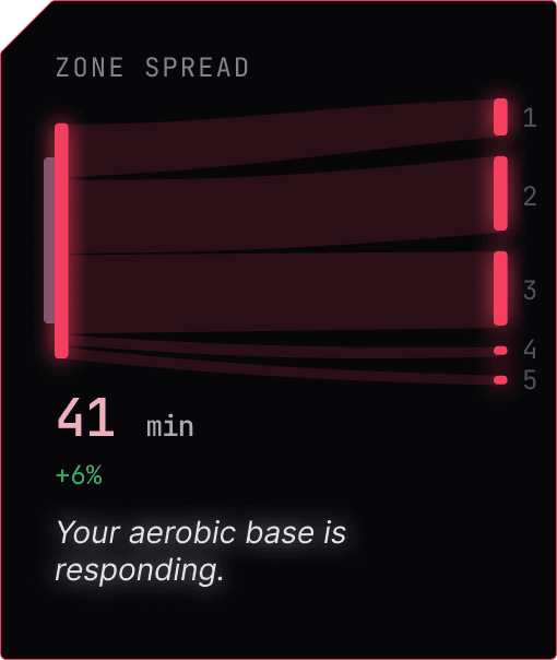
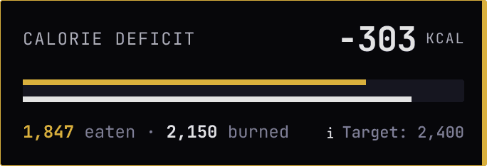
Strength, cardio, mobility, and nutrition, typically isolated in separate apps, come together in Kynso. By integrating them, Kynso reveals connections no single app can: for example, how cardio load impacts strength or whether recovery matches training volume.





desigh progblem
Bringing these domains together is only the start. Each has its own data model, vocabulary, and user expertise level. Combining them risks making the product heavier than the sum of its parts.
So my central design challenge: how can a four-domain product stay lighter and more usable than four single-domain apps?


User interviews across the range the product had to serve — people new to tracking through to athletes running structured programs.
Category audit. How people actually use fitness apps today: which ones they stack, where they abandon, what they never open twice.
Coaching content and sport-science literature. What the domains actually require, so the product’s model rests on the training reality rather than on two people’s habits.


Research surfaced two distinct types of complexity. The audience runs from beginner to expert, and every user, including experts, shifts between focused and analytical depending on the moment.
by expertise — via progressive disclosure
Users see only the essentials at first (log a lift, log a run), with deeper features (trends, biomechanics, periodization logic) accessible beneath the surface.
Gym mode

Desk mode



Sex-specific calculations
Metrics are computed using female physiology where reference data differs, rather than relying on male-derived defaults.

Cycle-aware training view
Strength and other metrics are displayed in relation to the menstrual cycle, allowing users to observe correlations in their own data rather than imposing prescriptive rules.

Weight as a modelled trend
Weight loss is not linear, and for many women, fluctuations are cyclical. Displaying a modelled trend that accounts for these fluctuations supports retention and is a deliberate design choice.
Goals & Tradeoffs
Most calorie trackers cost four or five taps per meal.
1
open the tracker
2
search a database
3
match an entry
4
confirm portions
5
log
The goal
Interviews and self-testing revealed that consistency is the primary challenge.
Calorie data is inherently imprecise, so displaying trends is the most valuable approach.
The tradeoff
I traded an imprecise food database for speed. Reading the number off the label instead of searching a database also makes you more aware.
We cut it to three steps.
1
open the tracker
2
ENter a number
3
Log

Research

Rapid Prototype

Daily Use
I live inside the product and refine it under real conditions
